Email design
Designed in the brand’s own look
Emails built from the brand’s own website: its logo, type, photographs and voice. Checked on a phone before you see them.
Start freeYour part: check the brand kit once, then approve each email or pin a comment where it should change.
From a website to an email
An email should look like it came from the brand’s own site.
Before any design, InboxSmith reads the brand’s website and keeps what makes it recognisable. You check it once; every email is built from it.
- Logochosen from the site’s own candidates, saved for light and dark grounds
- Coloursfrom the site’s stylesheets, given roles: ground, text, accent, button
- Typethe site’s fonts, matched to licensed web fonts
- Photographsthe brand’s own, products first; each kept or dropped
- Voicerules, words to use and avoid, and real lines from the site
- Factskept only when the site says them word for word
InboxSmith × Raffles Singapore · The booking confirmation
One idea: the evening you arrive.
A confirmation is a document the guest keeps and returns to, so it reads like the hotel’s own stationery, not like a campaign. Then it runs on the hours of the arrival evening.
- 01Header
The hotel’s own logo on ivory, as raffles.com shows it.
- 02Arrival
The house at dusk, full width. Its lamps come on, floor by floor.
- 03The reservation
Dates, suite and guests in a hairline table, like the hotel’s stationery.
- 04One action
Manage reservation, inside the first phone screen, with the cancellation note under it.
- 05Your suite
The suite’s own photograph, then its size, bed, verandah and what is included.
- 06Before you ask
Raffles’ own line, “Before you even think to ask”: the butler and the transfer from Changi.
- 07The house
The Grand Lobby and the Raffles Courtyard, side by side.
- 08Your first evening
The arrival evening hour by hour, from tea to the Long Bar, using each venue’s published hours.
- 09Night falls
“Until Thursday”, then the Long Bar at night, falling into the footer’s green.
- 10Footer
The hotel’s own footer: address, contacts and its links.
Checked before you see it
- Every product, price and photograph comes from the brand’s own catalogue. A design cannot invent one.
- Every claim is checked against the brand’s confirmed facts.
- Measured at phone width: nothing overflows, every image loads, and when there is an offer, the first button sits in the first screen.
- Scored against the brand’s own site and the phone layout by a separate review step, and revised when it falls short.
What you review
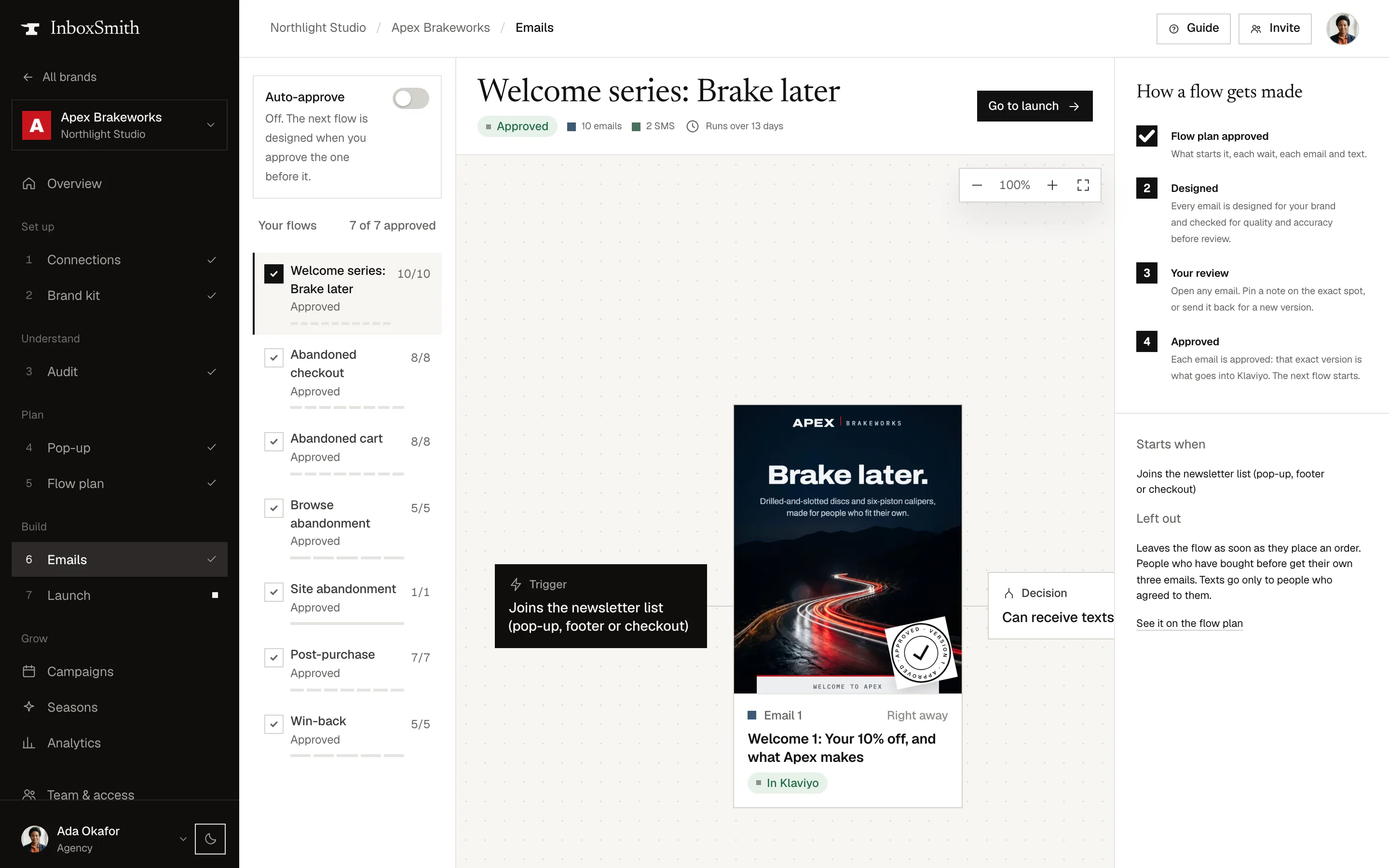
Each email arrives with its desktop and phone views. Pin a comment on the exact spot, ask for a change in your own words, or approve that exact version, one email or a whole flow at once.
Early customers
Read the email from start to finish.
Three emails from our early customers’ projects, each with its own audience and job.
Klaviyo build
Approved emails, triggers and timings in Klaviyo.
Take the tenth client the way you took the first.See what your email really earns.
Start free